Streamlining an icon: Rowes Wharf gets a sleeker look.
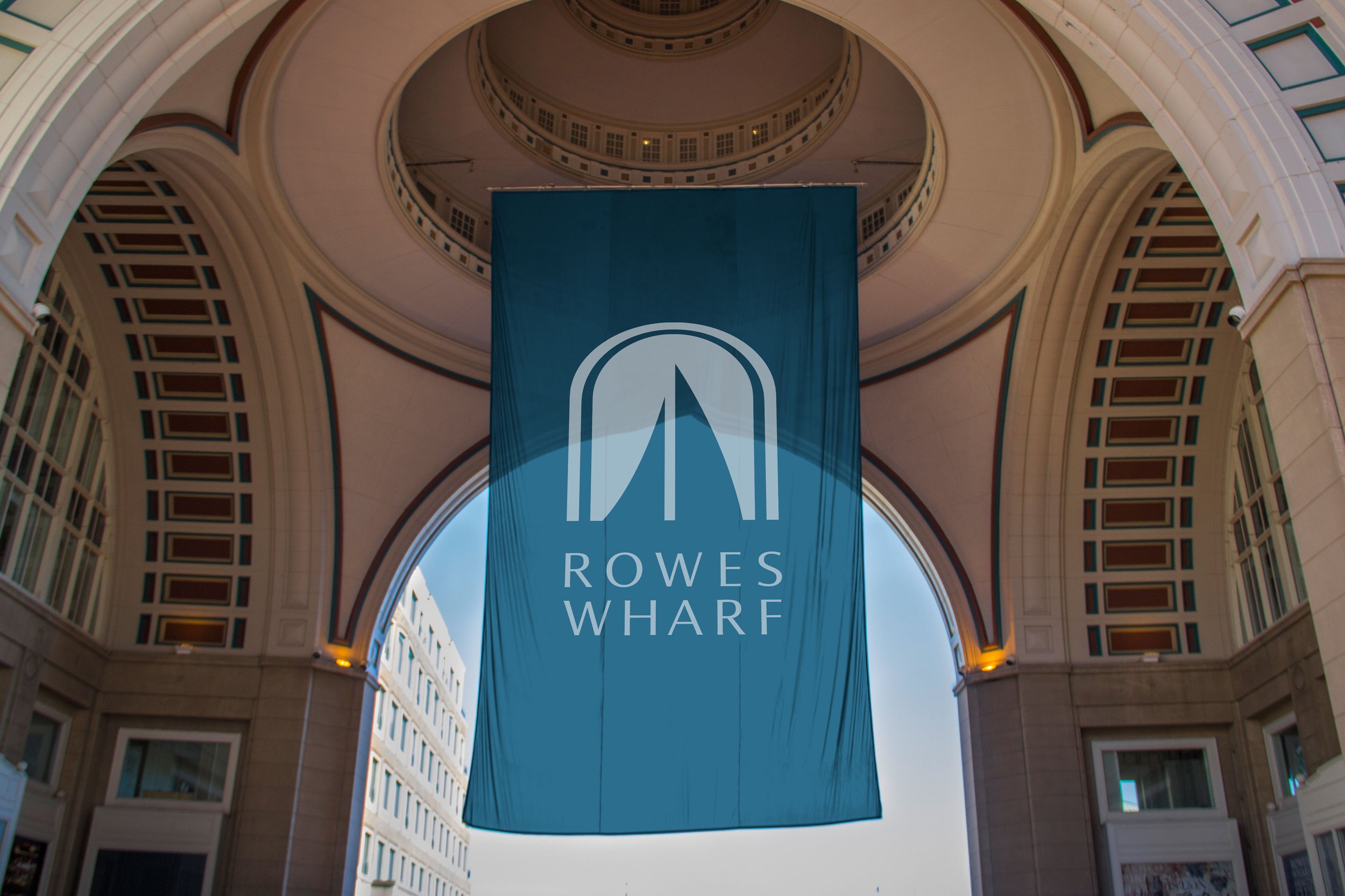
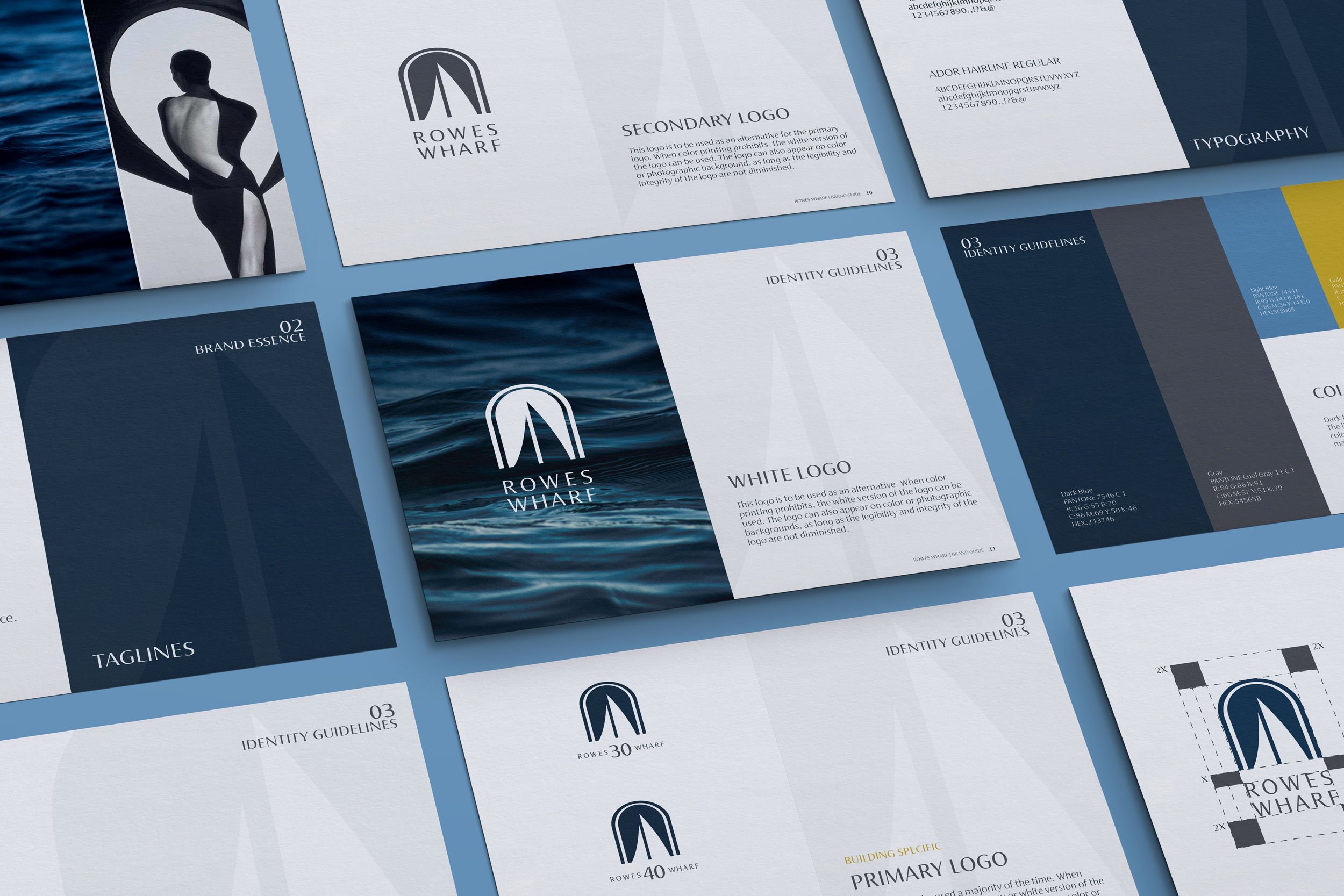
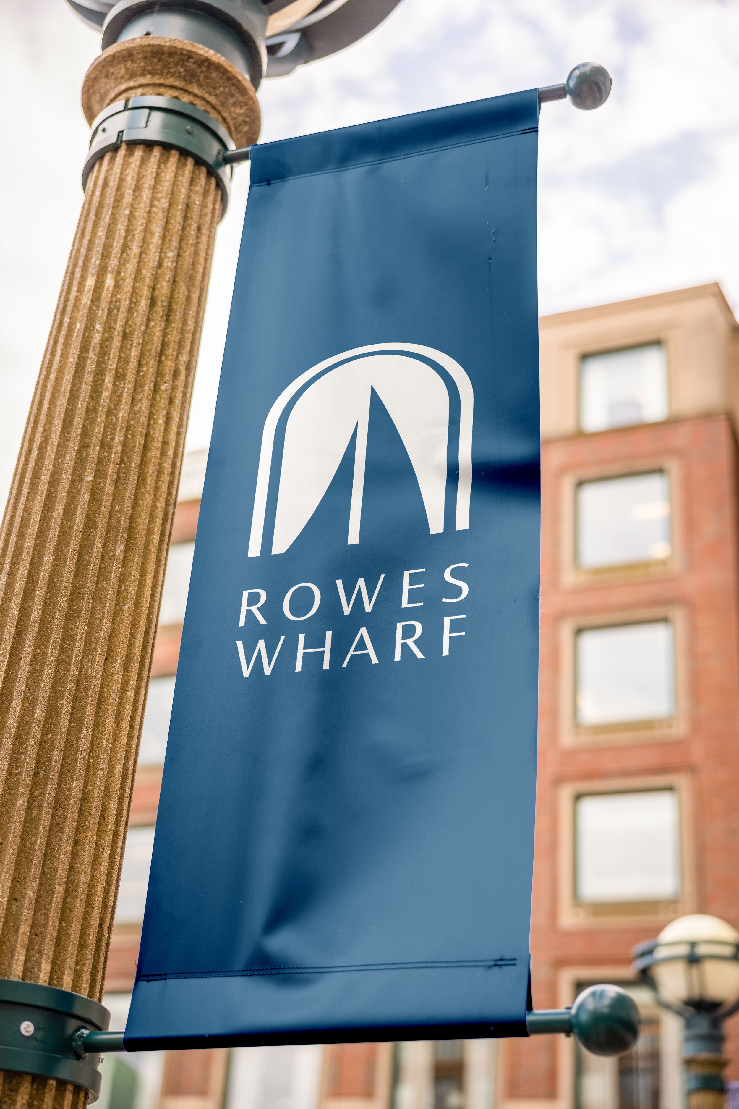
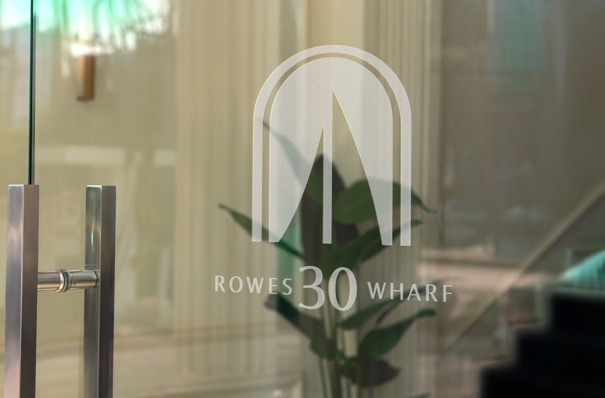
The task of refining the identity of a prominent Boston landmark required a delicate balance between preserving its historical significance and embracing a fresh look. A modern, forward-looking typeface was chosen to complement the recognizable architectural arch. The original logo detailed this “Gateway to Boston” along with a sailboat graphic. Carefully redrawing the arch and boat with a more refined stroke, overlaid a crisp color palette, and wrote new taglines to create a cohesive identity package.
Marketing Video.
Embarking on the journey of revitalizing the identity of one of the most iconic and easily recognizable locations in Boston was a task that demanded not only meticulous attention to detail but also a keen and imaginative vision. This endeavor required a delicate balance between respecting the historical significance that this location held in the hearts of Bostonians and the need to infuse it with a fresh, contemporary essence.


